UNK Headquarters at Sherwood Town Estate – a combination of fairytale facade and minimalist interior
OLGA
MELEKESTSEVA /
SERGEY
VOLOKITIN
Project details
The new headquarters of the UNK group of companies is located on Malaya Kaluzhskaya Street in a historical building, in the city estate of the Sherwoods, and in addition, the building has the status of a cultural heritage site. This unusual headquarters bears the fabulous and unofficial name “Teremok”. The three-story stone house in the pseudo-Russian style was built in 1911 according to the design of Nikolai Butusov for a creative dynasty. The most famous representative of the family is the architect Vladimir Sherwood, the author of the project of the building of the Historical Museum on Red Square.
The reference to the national antiquity and the unusual appearance of the building became both the complexity and the unique feature of the object. All details of Old Russian architecture have been preserved in the building: windows of different shapes decorated with sandriks and trims with complex geometry, the second-floor balcony with a massive kokoshnik, resting on twisted columns, the front porch and a multi-pitched roof with tents and turrets.
The new headquarters turned out to be truly unique and inimitable, and the architects’ idea to “make friends” between antiquity and modernity is admirable.
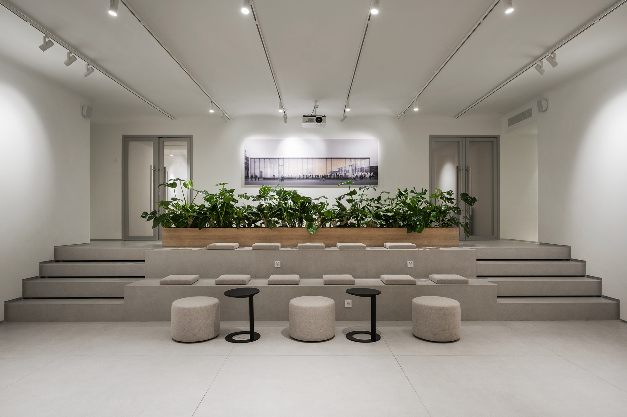
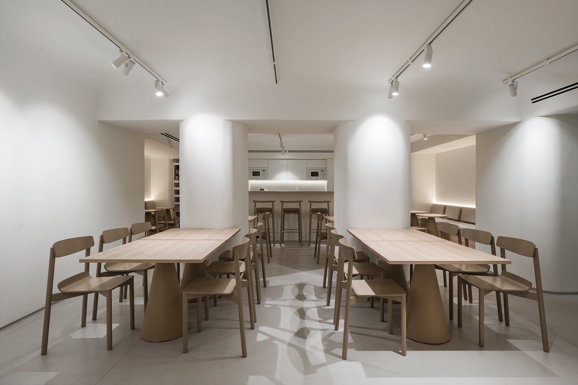
The corporate interior of the UNK group of companies is a unique, well-thought-out multifunctional space. For example, in the basement there are public spaces: a cafe, a lecture hall with an amphitheater and a screen for presentations, where it is planned to hold not only internal but also external events. The interior also provides space for an exhibition where the history of the estate will be presented.
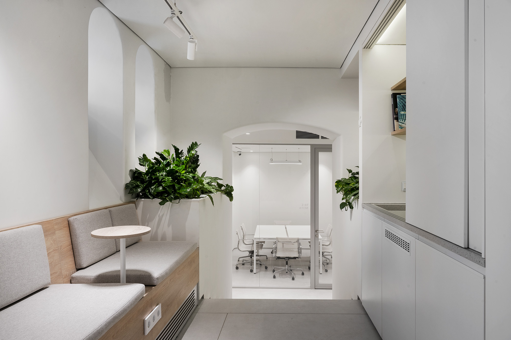
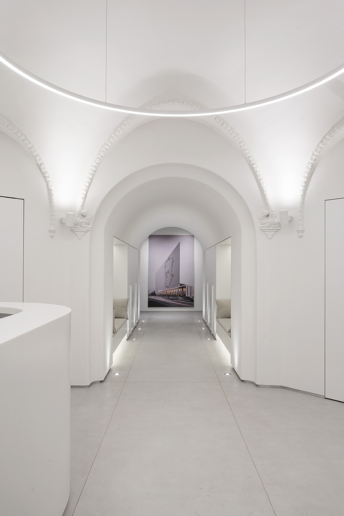
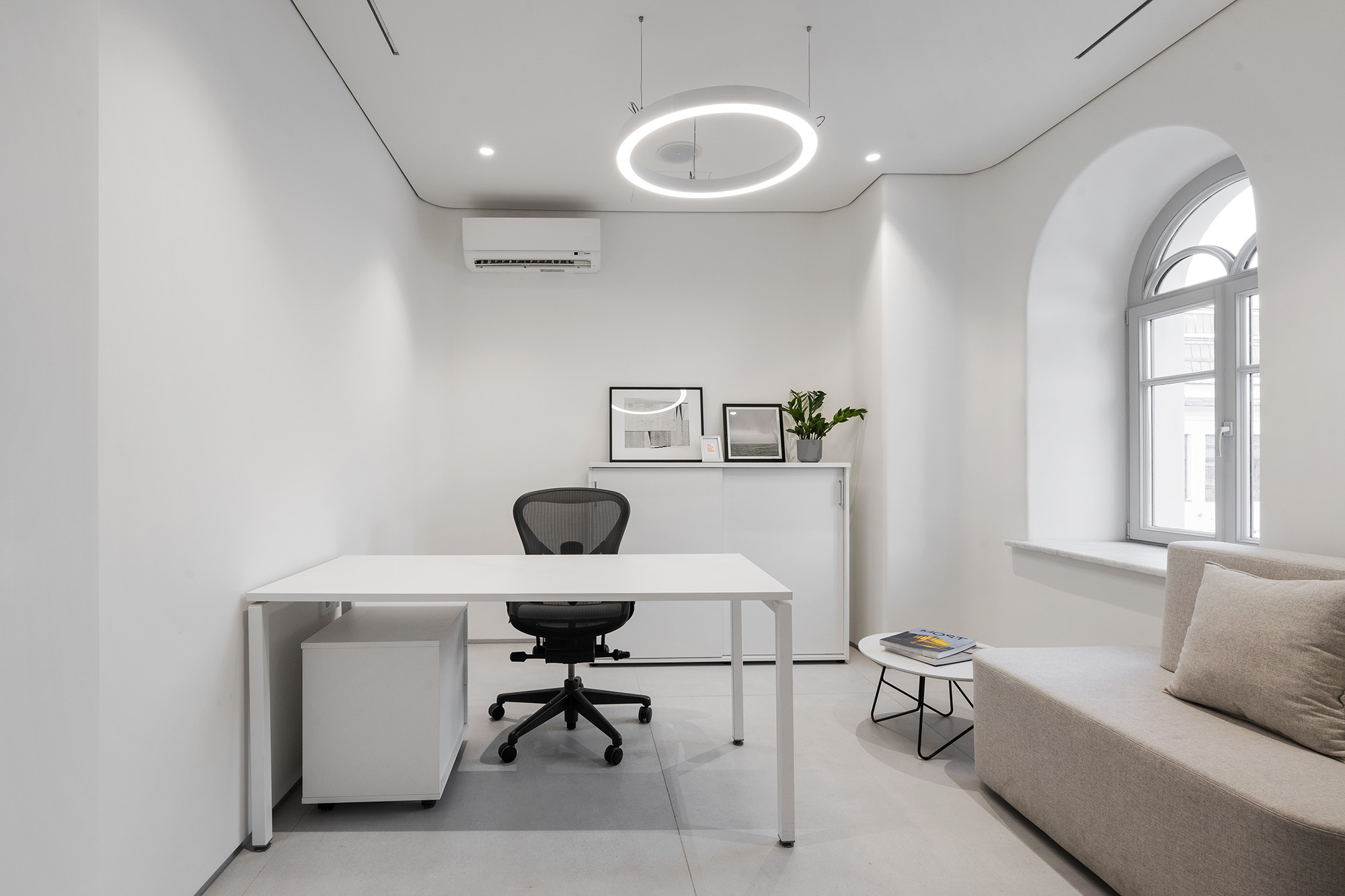
A suitable lighting solution had to be developed for such a multifunctional space. Since the interior is made in white tones (also to compensate for the access of natural light inside, as the windows are mostly small) with a spot addition of corporate red in details, lighting effects help to shape the space and perform not only functional tasks, but also to create the right different atmosphere.
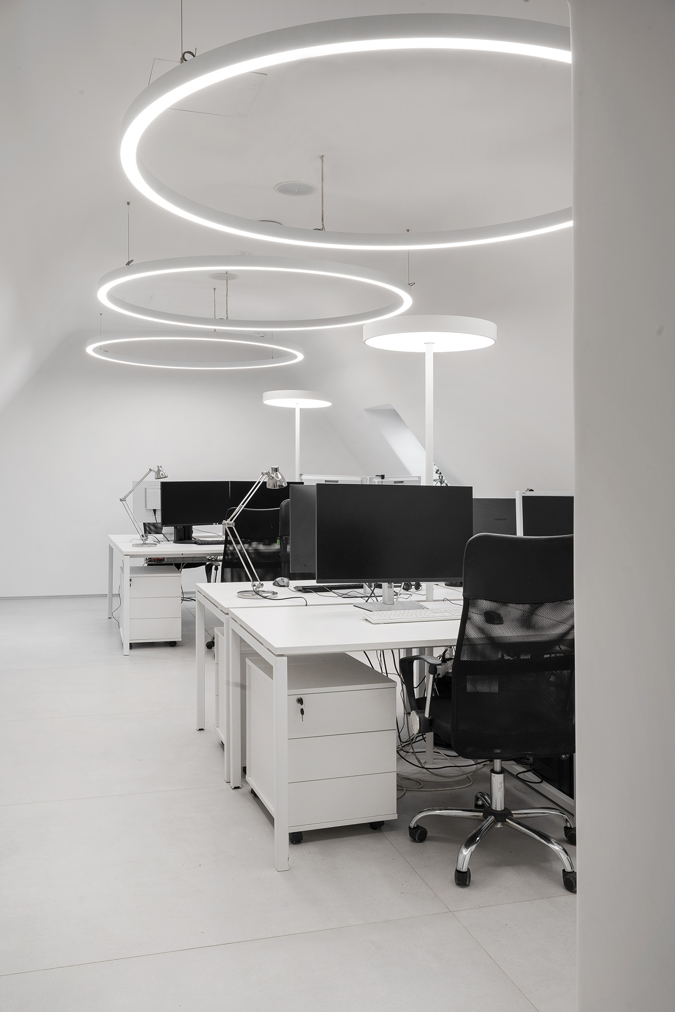
Not only ergonomics and design play an important role in workspaces, offices and meeting rooms, but also visual comfort. This is achieved through the presence of well-thought-out light groups, exact compliance with lighting standards for work areas and meeting rooms, as well as the possibility of dimming lighting equipment. Pendant luminaries in the shape of a circle or ring, in addition to performing functional tasks, are also responsible for matching the design solution with rounded shapes.
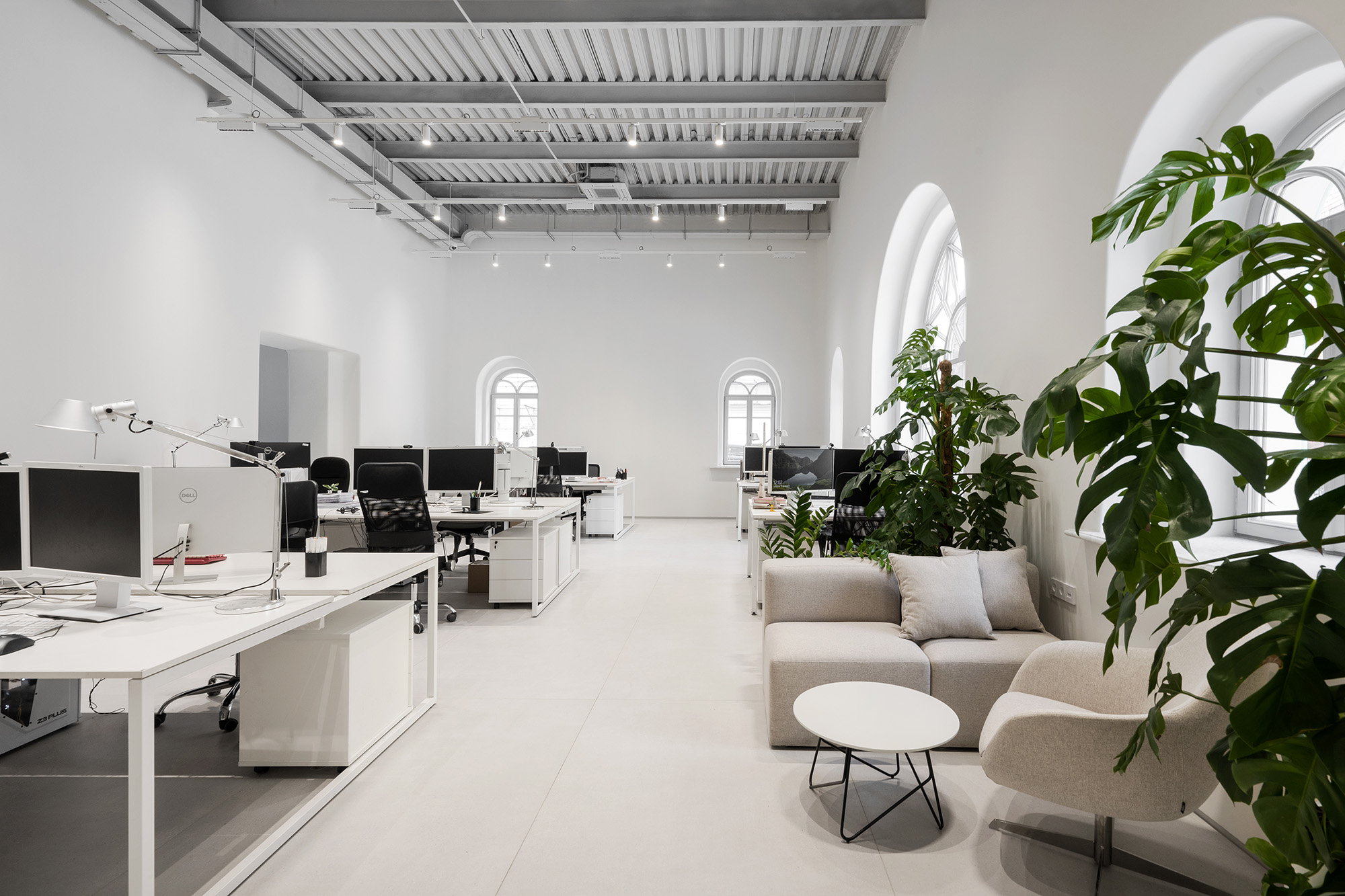
Openspaces use track systems that combine accent light created by rotating led luminaries and lighting fixtures with wide optics that provide general lighting. The use of suspension track systems allow you to place lighting equipment at the desired height, regardless of the characteristics of the ceiling, so the light conditions in all work spaces are the same and comply with Russian and European standards.
The presence of track systems in workspaces provides flexibility in lighting solutions - the ability to customize comfortable light at each workplace. Using projectors, you can easily redirect, remove or add lighting locally without changing the amount of light in other work areas.
Also, each workplace is provided with an individual table lamp, allowing employees to adjust the lighting conditions independently. In some meeting rooms, it is possible to dim all lighting fixtures, and in some rooms, minimalist floor lamps are additionally installed.
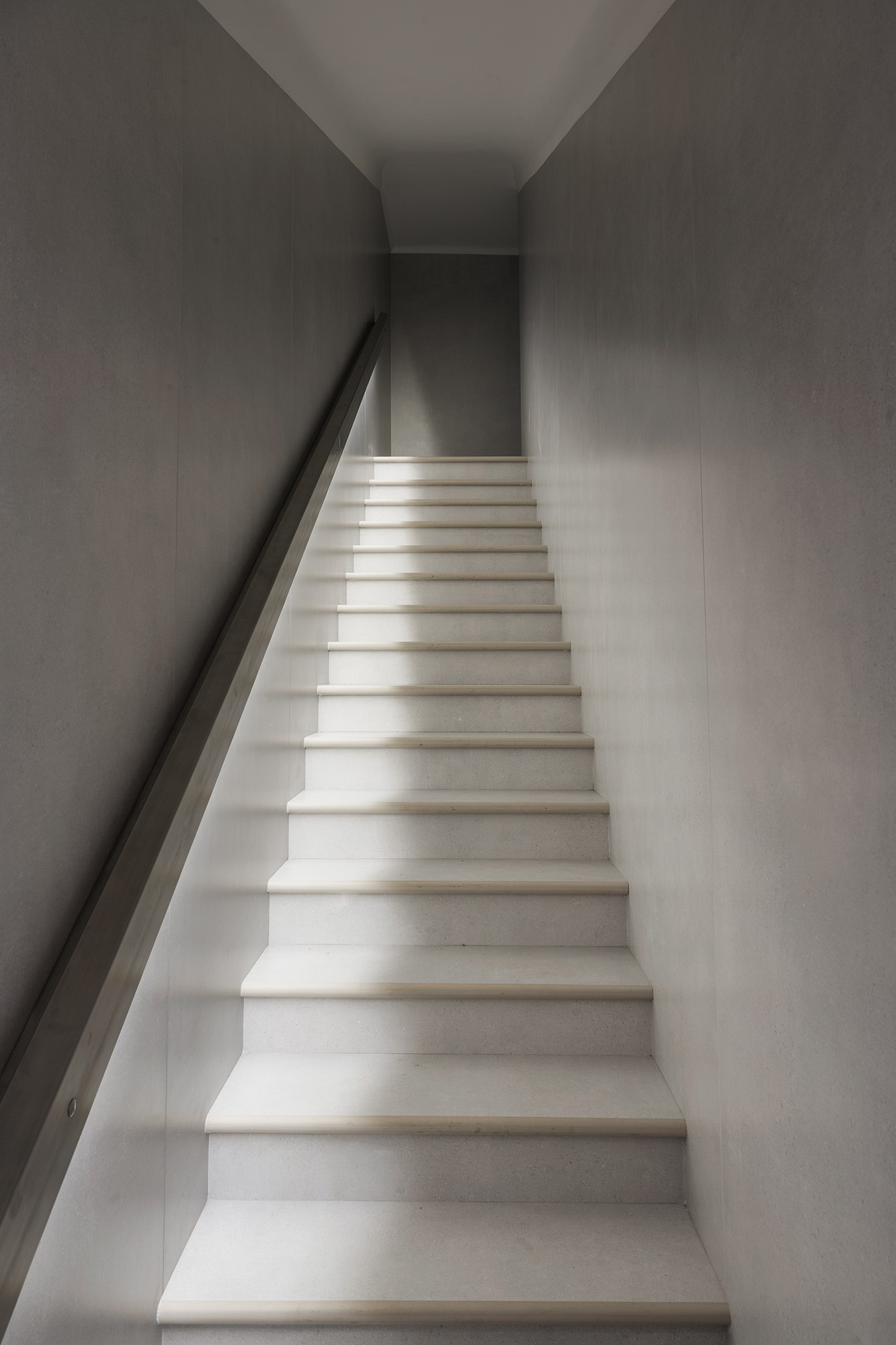
To create a uniform level of illumination throughout the entire volume without “dark corners” were used functional recessed lighting fixtures. Particular attention was paid to the space on the third floor with a mansard roof and low ceiling height. In the basement, the ceiling is also quite low, but thanks to the optimally organized space and lighting design solution, you get the feeling that the ceiling height is higher than it is. This was achieved with the help of spotlights on tracks, light sliding along the walls in niches, as well as light accents and vertical lighting in general.
The color temperature is the same on all working floors and is 4000 K. The selected color temperature level helps employees concentrate on their work and is also optimal for interiors in which white is the predominant color.
For the basement floor, where the main dining room, recreation and entertainment areas are located, a warmer shade of light was chosen (color temperature - 3000 K). On the first, second and third floors (above ground), differences in light conditions between work areas and recreation areas (corridors, areas expectations, etc.) are achieved by different light diffusion angles, wattages, fixture targeting.
A seemingly simple monochrome and minimalist space is perceived differently and also performs different functions thanks to the light accents in the space, various optics and the possibilities of using lighting scenarios
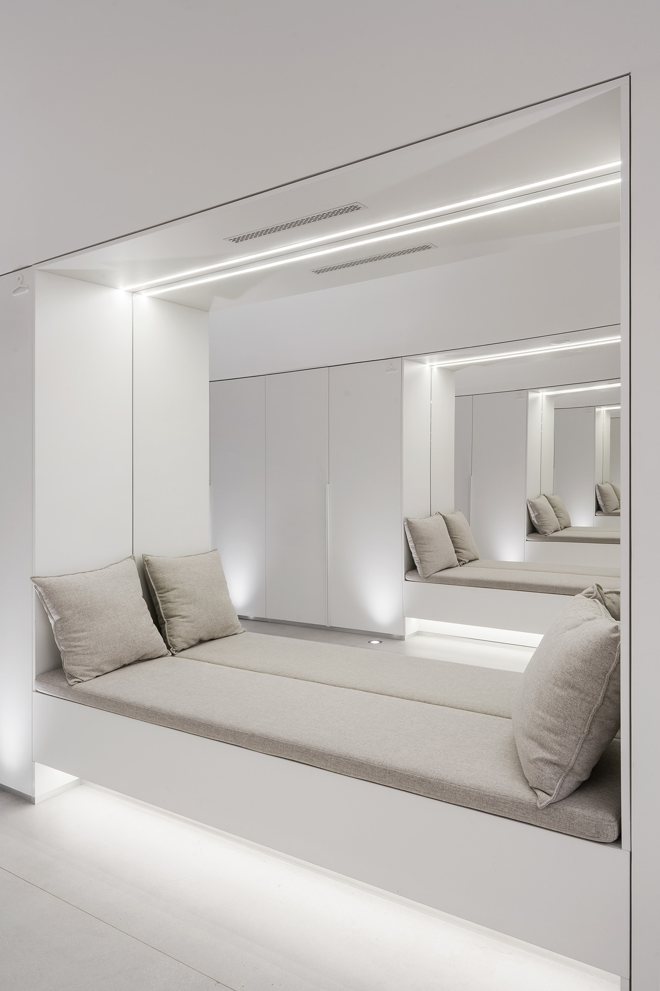
In order to make the space seem less flat and more three-dimensional, the architects provided structural niches for “hidden light”. For example, in bathrooms, linear luminaries are placed behind panels or located significantly above eye level. Light streams from behind panels or reflects off curved surfaces, softly filling the space with light. There is a feeling of intimacy, tranquility and privacy - which is quite relevant in this place. By the way, in the bathrooms there are no luminaries on the ceiling; it is absolutely smooth. The problem of illumination here is solved with the help of reflected light. Also, the idea of hidden light is complemented by illuminated mirrors on the back side. The absence of the usual ceiling lights helps to preserve the “purity” of the space and emphasize the laconic modern interior design.
Architectural lighting helps to reveal the unique architecture of a historical building at night. The fabulous image in all its splendor of form and color is emphasized with the help of light. To prevent the building from appearing flat and to blend seamlessly into the surrounding light environment, light is used locally, only where it’s needed. Light highlights the main architectural elements and details - window openings, sandriks, platbands, the “kokoshnik” above the 2nd floor balcony and the inside of the porch. The visually illuminated porch flows into an illuminated first floor corridor, which continues in a single line and is visible through the glass front door. In this way, the exterior seems to flow into the interior, linking the street and the interior space with light.
Thanks to the lighting techniques used for facade lighting, it seems as if the building is in the dark, although all its architectural features can be easily read. And you can also see that the work is boiling inside and the illuminated volume of the porch as if invites passers-by to look into this wonderful “Teremok”.
There is also an additional lighting mode for illuminating the building. It acts as a festive mode and is switched on when necessary, giving a festive look to “Teremok” building. The scenario is realized with the help of lighting fixtures with flood optic installed on poles placed on the territory in front of the building. The brightly lit facade, complemented by light accents on architectural elements, turns the small building into a light dominant.
Lighting design solution for an office with an industrial character on the territory of the Bolshevik factory
Lighting design project of the office of an investment company in the field of IT on Yakimanskaya embankment
Lighting design for Gazprom Neft Digital Transformation Centre Zifergauz
